Vote Yes on Measures KK and JJ for an All-In Oakland

As America’s cities face the challenges of inequality, structural racism, and displacement, local governments must take bold steps to put in place a new model of equitable growth. One imperative is to transform underinvested neighborhoods into “communities of opportunity” that provide their residents with the ingredients needed to thrive. That is why I am excited about Oakland’s Measure KK, a $600 million infrastructure bond that promises to boost opportunity and mobility for residents in long-underserved Flatland neighborhoods, and Measure JJ, a measure to extend and reform renter protections for Oakland’s residents vulnerable to displacement.

Infrastructure — streets, sidewalks, parks, water lines, and more — might not sound like the solution to Oakland’s challenges of uneven growth. But it is crucial. As Transportation Secretary Anthony Foxx likes to say, infrastructure is a “ladder to opportunity” for struggling families. Streets and transit routes make it possible to access family-supporting jobs. Parks and recreation centers provide spaces to exercise, play, and socialize. Libraries connect people to learning opportunities. And so forth. Infrastructure is the skeletal support that connects people to resources, opportunities, and each other.

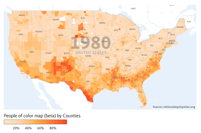
Despite its critical role in bridging to opportunity, years of discriminatory land use planning and inequitable investment have saddled low-income communities of color with some of the worst infrastructure deficiencies. Oakland overall needs an estimated $2.5 billion in infrastructure investment — including a $443 million paving backlog. The neighborhoods where cash-strapped families can afford to live are more likely to have potholes, crooked sidewalk squares, and tattered playground equipment. These inequities aren’t just inconveniences: they drain already-tight family budgets. Oakland residents spend hundreds of dollars every year on flat tires and car repairs due to potholes and bad roads — and this “hidden tax” hurts low-income residents far more than wealthier drivers.

Measure KK has the potential to dramatically improve health, quality of life, and economic security for thousands of Oaklanders. With Measure KK funds, Oakland’s new Department of Transportation is prepared to deliver ten times the current levels of street repairs for 10 years. Imagine, instead of just a quarter of our streets being in good shape, in ten years 72 percent of our roads could be smooth and safe.

Moreover, the funds would go where they are most needed. While typical infrastructure bonds do not target resources, Measure KK includes historic social equity requirements that will ensure that investments are distributed fairly across Oakland, and especially in underinvested, low-income communities of color. Projects will be selected through a transparent, multilingual public process, and an oversight committee will conduct independent audits of the spending. My organization, PolicyLink, is looking forward to working with the city, under our All-In Cities initiative, to develop the best possible equity criteria and make this infrastructure bond a model for the nation in terms of equitable infrastructure funding.

In addition, Measure KK has an intentional focus on “investment without displacement.” $100 million of the proceeds will fund anti-displacement and affordable housing preservation. This is essential in a city facing a ballooning housing crisis, where rents have increased 34 percent since 2011. Measure KK will provide critical funds to protect Oaklanders all across the city from being forced to move out of affordable housing so we can keep long-term residents in our community. Measure JJ will in turn add protections to residents in their existing rental homes as their neighborhoods improve.

Building the infrastructure needed to transform neighborhoods is the right thing to do for our neighbors who are struggling to stay and succeed in a rapidly-changing city. It is also a smart economic strategy. With the right hiring, job quality, and workforce development strategies in place, this investment can provide career pathways to hundreds of Oaklanders of color who are currently locked out of good jobs. Improving infrastructure in distressed neighborhoods will also have indirect economic benefits because living in a neighborhood with quality parks, safe streets, sidewalks, and other quality infrastructure improves one’s economic chances. There is also evidence that lower-wealth residents who stay in gentrifying neighborhoods improve their financial conditions (thus also adding to the local economy), while those who move out end up living in neighborhoods with higher unemployment, lower-performing schools, and lower quality of life.

On Tuesday, Oaklanders have a chance to truly expand opportunity and take a serious step toward making Oakland an “all-in” city where everyone — especially those who’ve been waiting the longest for this moment of resurgence — has a chance to fully thrive. I encourage all Oaklanders to vote YES on Measures KK and JJ this election day.

Angela Glover Blackwell is the Chief Executive Officer of PolicyLink, a national research and action institute advancing economic and social equity by Lifting Up What Works.

Six Ways to Vote for Equitable Growth and Shared Prosperity

Introducing New Neighborhood Opportunity Maps


We know that opportunity differs by neighborhood, and maps are one way to visualize this variation across a given city, region, or state. That’s why today, we are adding mapping breakdowns to the following four indicators on the National Equity Atlas:


These new interactive maps allow you to visualize data by county or by census tract as well as by city, region, or state. You can also toggle back and forth between different years to see how the geography of opportunity has changed over time and create custom maps using an interactive filter and scroller. On the race/ethnicity map, for example, the scroller allows you to visualize measures of opportunity (e.g. homeownership) in relation to neighborhood composition (e.g. the share of the Latino population). And on the disconnected youth and unemployment maps, the scroller allows you to visualize the indicator as neighborhood compositions (e.g. share of the Black or Native American population) vary.

This blog walks you through how to access and use the new maps. Register for our 30-minute webinar on November 2 for a live walk through.

How to find the new maps

To access the new maps for the people of color indicator, click on the Indicators tab in the top navigation bar. Then under the Demographics menu, select “People of color.” You can look at the data by county (the default), by the largest 150 regions, or by state. You can also toggle back and forth between every decade from 1980 to 2040 to see how the share of people of color in the U.S. has changed over time. The GIF below pulls from the new maps to show how the share of people of color has changed from 1980 to 2010 and how it is projected to change by 2040. You can also see the new people of color map on the homepage of the Atlas.

You can filter by White areas, Black areas, Latino areas, etc. in the people of color, unemployment, and disconnected youth maps, and you can also filter by different measures of opportunity in the race/ethnicity map. To get to the race/ethnicity indicator, select Race/ethnicity (also in the Demographics menu).

The default breakdown shows a chart of how the racial/ethnic composition of the country has changed from 1980 to 2010, and how it’s projected to change through 2040. Underneath the graphic display, you’ll see the different breakdowns, the second of which is the “Race and ethnicity map.” The default map is the percent people of color in 2014, but you can also look at the data from 2000. Under the year options, you’ll see the six major race/ethnicity groups and all people of color. If you select “Native American”, for example, you’ll get a map of the percent Native American by county. The darker purple counties represent areas with a Native population larger than 40 percent (see screenshot below).

Using the opportunity filters

The filters located on the bottom right of the page allow you create custom maps based on various measures of opportunity such as homeownership and the share of the population with an associate’s degree or higher. To illustrate how the filters work and how to access data by neighborhood, take the state of Mississippi as an example.

You’ll notice that census tracts are not one of the geography options in the map above. In order to view the data by census tract, you must type in a state, region, or city in the Explore box. After typing in and selecting Mississippi, you get a map of the state by tracts (the default geography at the sub-national level). If you click on “Black”, you get a map of the Black population share. The purple tracts are neighborhoods with a Black population greater than 40 percent. The light blue areas, on the other hand, have a Black population under 10 percent.

To use the filters, first select one, like homeownership, then move the scroller at the bottom to only show areas where the homeownership is at least a given percentage. The overall homeownership rate in Mississippi is 68 percent, but moving the scroller to 68 percent, creates a map of census tracts where the homeownership rate is 68 percent or higher and many of the purple tracts (representing majority Black tracts) in the northwestern part of the state disappear as a result (see maps below). Those tracts that disappear have a homeownership rate less than 68 percent.

Using maps to inform decision-making

These maps can be especially helpful in developing targeted employment or workforce development initiatives. The overall unemployment rate in Mississippi was 10 percent, but this was clearly not the case across all census tracts. Filtering the map by tracts with an unemployment rate of at least 15 percent produces a map with several majority Black tracts. This map can support programs and initiatives through the state workforce investment board by ensuring that resources are targeted to communities that need them most.

Note: While the size (land area) of the census tracts in the state varies widely, each has a roughly similar number of people. A large tract in a more rural part of the state likely contains a similar number of people as a seemingly tiny tract in an urban area. Care should be taken not to pay an unwarranted amount of attention to large tracts just because they are large.

Mississippi has the highest rate of disconnected youth of all states, so understanding how the number and share of disconnected youth varies across the state is central to developing an effective workforce development or education program. To find the map for disconnected youth, select “Disconnected Youth” in Readiness section of the Equity menu. The very last breakdown is the mapping breakdown. As you’ll see in the map below, there are several red census tracts, symbolizing areas where the share of disconnected youth is greater than 20 percent. As you hover over different tracts, you can see both the share and the total number of disconnected youth. In census tract 9504 in Prentiss County, for example, more than 100 young people, or 57 percent of 16 to 19 year olds, were disconnected from both school and work.

The filters and scroller on this map allow you to visualize disconnectedness in relation to neighborhood composition. As you filter to majority White or majority Black neighborhoods, you’ll notice how disconnectedness varies geographically.

For a walk through of the unemployment maps, view our previous blog. For a live walk through of the new maps, register for our webinar. Share your thoughts or questions during the webinar or through our contact form.

This Atlas of Racial Equity Just Keeps Getting Better

Cross-posted from CityLab

How do race and inequality intersect with space? American mapmakers have been trying to answer this question since at least 1895, when a group of reform-minded Chicago women published the Hull-House Maps and Papers. At the height of the Gilded Age, inequality was skyrocketing. Housing and labor conditions among droves of new immigrants were dire.

Putting their faith in data as catalyst for progress, the Chicago reformers meticulously surveyed the ethnicities and wages of industrial workers living in a tenement neighborhood on the Near West Side, and then plotted their findings in vivid color on a set of blank property maps. The result was a groundbreaking visual demonstration of poverty as a product of a person’s spatial context, rather than some damning individual quality—a belief that was commonly held then (as it is now).

Flash-forward 120-plus years, and we’re living in an era some call a second Gilded Age. In fact, income inequality is even worse now than it was then. Mapmakers are still figuring out the best ways to plot disparities across all sorts of measures—jobs and school quality, environmental health, and transportation access, for example—to advocate for policy change. The National Equity Atlas, developed by PolicyLink and the University of Southern California’s Program for Environmental and Regional Equity (PERE), might be the best and most comprehensive graphic call for economic equality available today.

Read the full article in CityLab.

A Seat at the Table: Through Community Participation, New Orleans Leads the Fair Housing Movement

Isabel Barrios, a program officer at the Greater New Orleans Foundation, recently facilitated a conversation with young people in New Orleans in which they were asked what health and public safety mean to them. They responded by saying things like: "It means not hearing gunshots when I'm playing on the basketball court," and "I would be able to ride my bike somewhere and not have to worry about it being stolen," and "Health means having water fountains in our neighborhood, because it can get very hot out and I want to be able to drink water when I'm playing outside."

"There were all of these great things that all of these kids brought up that barely fall within into what people call public safety in city planning processes," said Barrios. "There is an incredible opportunity if you have meaningful engagement and really hear people out." She mentioned that when residents asked to return to their public housing developments after Hurricane Katrina, their calls were translated by politicians into requests for more "affordable housing" in the form of vouchers — signifying that filtering may still affect their trust.

Last week, the City of New Orleans and the Housing Authority of New Orleans (HANO) made a concerted effort to respond to city residents' specific appeals for improved housing and greater connection to opportunity in the joint Assessment of Fair Housing (AFH) plan they submitted to the U.S. Department of Housing and Urban Development (HUD). By submitting this plan, New Orleans became one of the first of 20 jurisdictions in 2016 to adhere to the update to the Fair Housing Act released in 2015 requiring federal housing funding grantees to "Affirmatively Further Fair Housing" (also known as the AFFH rule). Over 100 more will follow in 2017, and all remaining HUD jurisdictions in the following years. The revamped AFFH rule lays the foundation to ensure that HUD resources are being effectively used to foster communities of opportunity. The framework helps cities, counties, regions, states, and housing authorities examine historic patterns of segregation, expand housing choices, and foster inclusive communities free of discrimination.

Community outreach that builds on past efforts

Over the course of the summer and early fall, HANO and the city met with residents, housing, transportation, and health advocates, and community organizations to get their input on the housing opportunity plan. They also coordinated with the Greater New Orleans Fair Housing Action Center (GNOFHAC) to hold sessions to train community-based groups on the more technical aspects of the AFH plan, and to engage communities not usually at planning tables. Seven partner groups (including PolicyLink) served as a coordinating committee that synthesized community input, guided research, addressed gaps in the data that were being gathered, and drafted the Assessment of Fair Housing that set goals for healthy communities of opportunity and prioritized actions to be pursued over the next five years.  The plan's development was guided by equity, as defined by PolicyLink: "just and fair inclusion into a society in which all can participate, prosper, and reach their full potential."

The plan includes a summary of residents' concerns gathered during the community participation process channels, such as escalating housing costs within proximity of new hospitals (making both health care and job access more difficult), criminal background checks limiting employment opportunities, and transportation services prioritizing tourists over transit-dependent residents. It also reports on demographic trends in the city and where racially/ethnically concentrated areas of poverty exist. The numbers were revealing, with 66 percent of the more than 75,000 renter households classified as low-income, and 77 percent of those households reporting housing problems.

The factors contributing to disparities in access to opportunity informed the development of the AFH plan's key goals, which include expanding affordable housing in high-opportunity areas, reducing housing segregation, and prioritizing public investments in transit, quality schools, housing, parks, and other amenities in underserved communities. (Read more about the plan's goals here.)

The AFH plan is building on recent community-based planning efforts, including: HousingNOLA, a 10-year strategy and implementation plan launched in August 2015 as a partnership of community leaders and public, private, and nonprofit organizations working to solve New Orleans's affordable housing crisis; Housing for a Resilient New Orleans, a five-year strategy for the city to build or preserve 7,500 affordable housing units by 2021; and a rental housing assessment released in March 2016 — conducted by the Center for Community Progress and commissioned by the New Orleans Redevelopment Authority — which found that nearly four out of five low-income, cost-burdened renter households in New Orleans are Black.

"Redlining is not a thing of the past"

The community engagement groundwork laid through these other strategic processes had a direct impact on the AFH plan, and will enable concrete federal resources to be invested in results. Andreanecia Morris, executive director of HousingNOLA, related how the HousingNOLA community review team recommended that the AFH plan look to leverage more private investment in low-opportunity neighborhoods through encouraging banks to spend their Community Reinvestment Act (CRA) money in those places — fulfilling the banks' obligation to meet the credit needs of low- and moderate-income neighborhoods.

"Redlining is not a thing of the past," said Morris. "We called for an assessment of where lenders are working in New Orleans. The community took advantage of the opportunity to participate in the Louisiana Reinvestment Summit and submitted and integrated those comments into the AFH plan and HousingNOLA's 2017 Action Plan."

"Racial discrimination undergirds a lot of the discrimination that we see"

In addition to leading the community engagement work of the AFH plan, the Greater New Orleans Fair Housing Action Center provided data to the city and HANO about both public sector barriers and private acts of discrimination to fair housing choice.

"Racial discrimination undergirds a lot of the discrimination that we see," said Cashauna Hill, executive director of the Center. "When we conducted an investigation of landlords discriminating against housing choice voucher program participants, we found that 80 percent would not accept voucher holders, which is still not illegal in New Orleans or in the state of Louisiana. We found that racial discrimination was at the root of some of the refusals to accept vouchers."

The Center receives daily calls from people being discriminated against: families being told that landlords will not accept children, people with disabilities finding limited choices for accessible apartments, renters living in substandard living conditions and struggling to get their landlords to treat mold or repair sewage lines.

"The good news is that we've got some leaders at the local level who are really interested in making living conditions better for renters in the city and in enacting policies to address the affordability crisis that's going on," said Hill. "We're working with a coalition that includes public health advocates to continue to raise these issues. What we need is a mechanism or framework that is going to require housing providers in the city to live up to their end of the deal to provide healthy and safe housing for the tenants." Adopting health and safety standards for occupied rental housing in the form of a citywide rental registry ordinance is listed as one of the short-term goals of the AFH plan.

Staying close to "the gumbo you like"

Barrios from the Greater New Orleans Foundation added that the release of New Orleans's AFH plan will have implications not only for HUD's decisions but also for the foundation's own grantmaking. As she said, if the Foundation wants to support a transit advocacy organization like Ride New Orleans, "the AFH plan will help us get a good sense of how Ride New Orleans is working along with housing advocates and workforce development folks to keep them abreast and informed. In that sense, the AFH plan is a great way to create a space for Ride New Orleans to be more connected with housing folks who may not have been making those connections before," she added.

"The people of New Orleans are pretty clear on their own sense of well-being," Barrios concluded, emphasizing once more the importance of meaningful community engagement in making far-reaching decisions about making places more opportunity-rich. "It's not only just connecting places to health care. Our sense of well-being can also be closely related to proximity to our families and friends — the things we've always known and cherished," said Barrios. "It can even be where you can get the gumbo you like — it's all part of what makes people feel good."

Earlier this year, PolicyLink and the Kresge Foundation released Healthy Communities of Opportunity: An Equity Blueprint to Address America's Housing Challenges. It explains how health, housing, and economic security policies must be aligned to achieve equitable housing outcomes and discusses how the AFFH rule presents a key avenue to advancing opportunity. PolicyLink played a supportive role in developing the Assessment of Fair Housing (AFH) plan in New Orleans.

Pages