Click Here! Five Essential Features in the Bay Area Equity Atlas
Our team is excited to put the Bay Area Equity Atlas tool’s powerful equity data, visualizations, and policy solutions into the hands of those working day in and day out to build a more equitable, sustainable, and thriving Bay Area.
We built this site to democratize data and make the facts accessible and actionable to everyone – including the grassroots organizations that possess invaluable firsthand knowledge of inequities yet often lack the resources to gather, analyze, and display the quantitative data so valuable to policy campaigns to address them.
Our aim was to create an easy-to-use community data system that builds upon the National Equity Atlas data infrastructure but delivers more data even more quickly, and provides local context and stories as well as additional ways to explore, share, and use the data.
Ready to dig in? Here are five essential features to help you explore the indicators in the Bay Area Equity Atlas.
#1 Indicator and Geography Selection Toolbar: Your Home Base
Once you are on the page for any indicator, the first interactive element you will find is the Indicator and Geography Selection Toolbar. This toolbar allows you to choose which of our 21 indicators you want to explore for any of the 272 geographies in the Bay Area Equity Atlas. To do so, follow these four steps:
B) Choose your indicator from the dropdown menu
C) Choose your geography type (State, Region, County, Sub-county, Large city, Other city or town, Census Designated Place)
D) Choose your geography from the dropdown menu
Here is how it looks for our Race/ethnicity indicator:
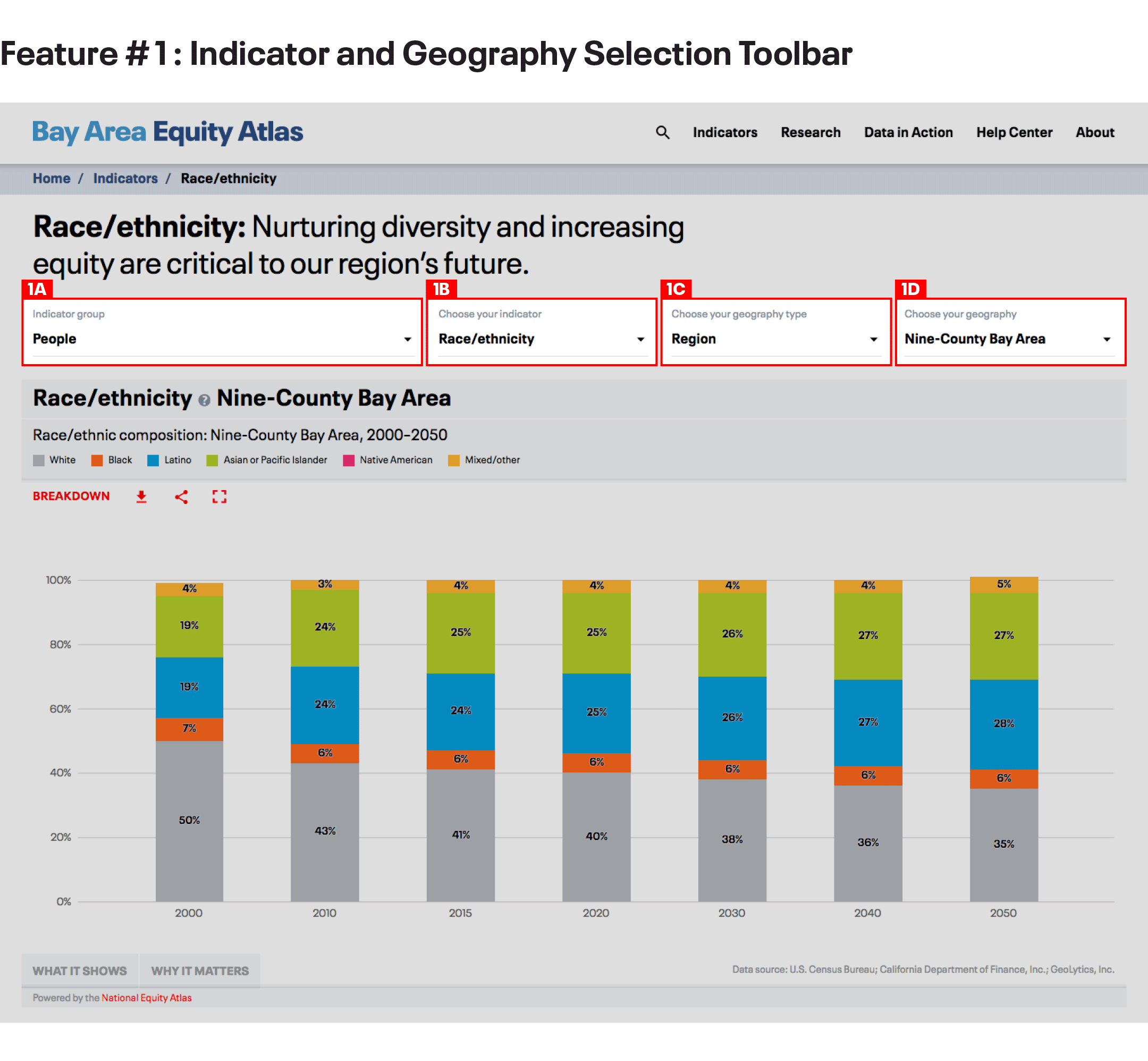
Note that the number of geography types available to you will differ from indicator to indicator, based on data availability (see this handy table). For example, you will not see “Other city or town”or “Census Designated Place” for the Economic gains: Eliminate rent burden indicator because data is not available for those smaller geographies for that indicator.
- MASTER IT: Change the geography and pull up the trend data for your community. What groups are growing and which are shrinking?
#2 Compare: See How Your Community Stacks Up
A second essential feature – also in the Indicator and Geography Selection Toolbar – is the Compare function. Comparison is a very important method for analyzing equity metrics, allowing you to see how your community (or a group in your community) is doing in relation to other communities (or the same group in a different community). This can help you understand the extent of disparities, assess what are the drivers of inequities, identify strategies to remove barriers, and set goals for progresson eliminating inequities.
Here is how to use the Compare function:
A) Select compare
B) Select a comparison geography type from the dropdown menu
C) Select a comparison geography from the dropdown menu
And this is how it looks for our Housing burden indicator:
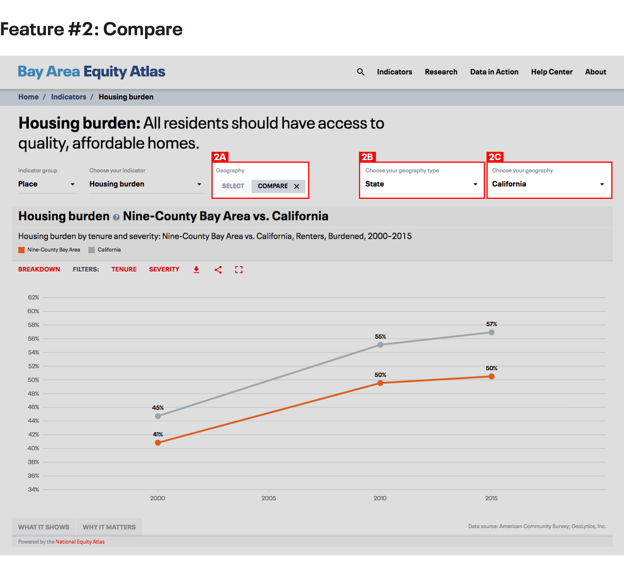
Note that the Compare function is not available for indicator breakdowns that contain multiple categories over multiple years (like the Race/ethnicity indicator you just looked at) because the display would not be legible.
- MASTER IT: Compare rent burden trends in your community and the Nine-County Bay Area region.
#3 Chart Breakdowns and Filters: Explore the Data
The Chart Breakdown and Filters feature is the true engine for data exploration in the Bay Area Equity Atlas. This is where you can disaggregate the data for multiple demographic groupssuch as race/ethnicity, race and nativity, race and gender, ancestry, and poverty level. It is also where you can get indicator-specific breakdowns of the data, by industry (for Business ownership and Business revenue), or by transportation mode (for Extreme commuting).
Take these steps to us the Chart Breakdown and Filters feature:
A) Select your breakdown
B) Select one or more filters
Here is how it looks for our Housing burden indicator:
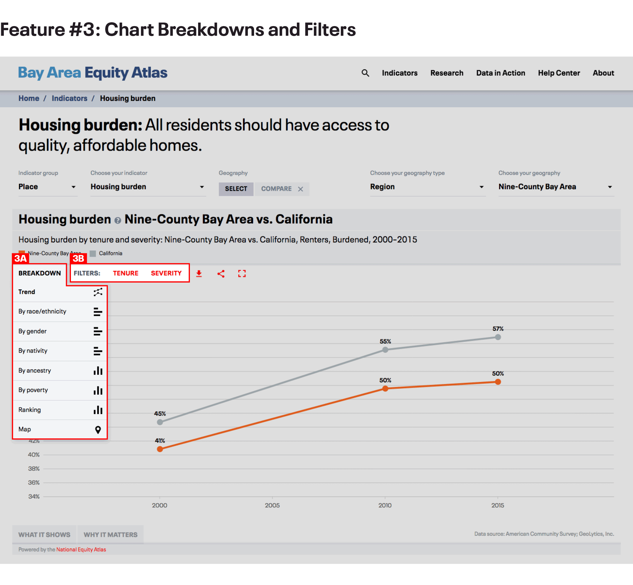
- MASTER IT: Explore the different breakdowns and filters for rent burden. Which groups have the highest rent burdens in your community? How does that compare with data for the Nine-County Bay Area?
#4 Map Filters and Full Extent: Visualizing Patterns
Mapping data by geography putsspatial inequities–which are also racial inequities, due to housing segregation and discrimination –intostark relief.The National Equity Atlas team worked hard to create a custom mapping system that enablesclear visualization of patterns across communities and correlations between race, place, and income. And we have improvedupon that foundation in the Bay Area Equity Atlas.
Follow these steps to Map Filters and Full Extent features.
A) In the chart breakdown, select the map breakdown
B) Under map geography, choose your geography type (Counties; Sub-counties; Cities, towns, and CDPs; and Tracts)
C) Select map filters
D) Select map full extent
E) Select a demographic group
F) Use the slider to see how communities with higher and lower shares of your selected demographic group perform on the indicator
Here is how it looks for our Voting indicator, selecting Tracts as the map geography and Percent Black, 10% in the map filter:
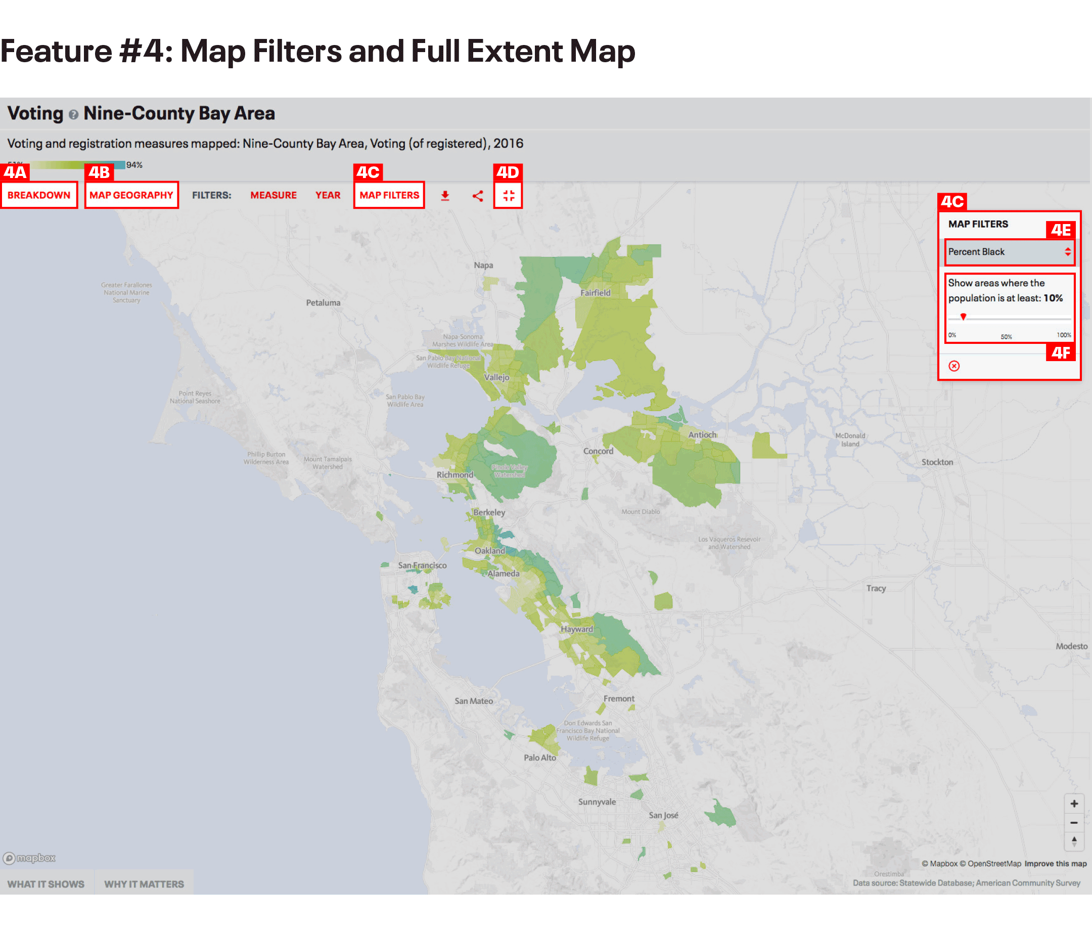
- MASTER IT: Zoom in and see how voting varies across communities with higher shares of Black residents. Change the “Measure” to “Registration” and toggle between “Registration” and “Voting (of registered) to see which communities with larger Black populations have high levels of registration and turnout, and which have high registration and low turnout.
#5 Downloads and Social Media Buttons: Share and Use Data Visualizations
The Bay Area Equity Atlas is a tool for community action, and we wanted to make it easy for you to use the data to highlight issues of inequity, build support for campaigns, and make your case for solutions with policymakers and others in positions of power. We also believe in open data and know that you want to be able to explore the raw data yourself. That’s why we built more sharing and download functionality into the Bay Area Equity Atlas.
Follow these steps to access our Download and Sharing features:
A) Select download type (Image or Excel worksheet)
B) Select sharing type (Facebook, Twitter, Email)
Here is how it looks for our Voting indicator:
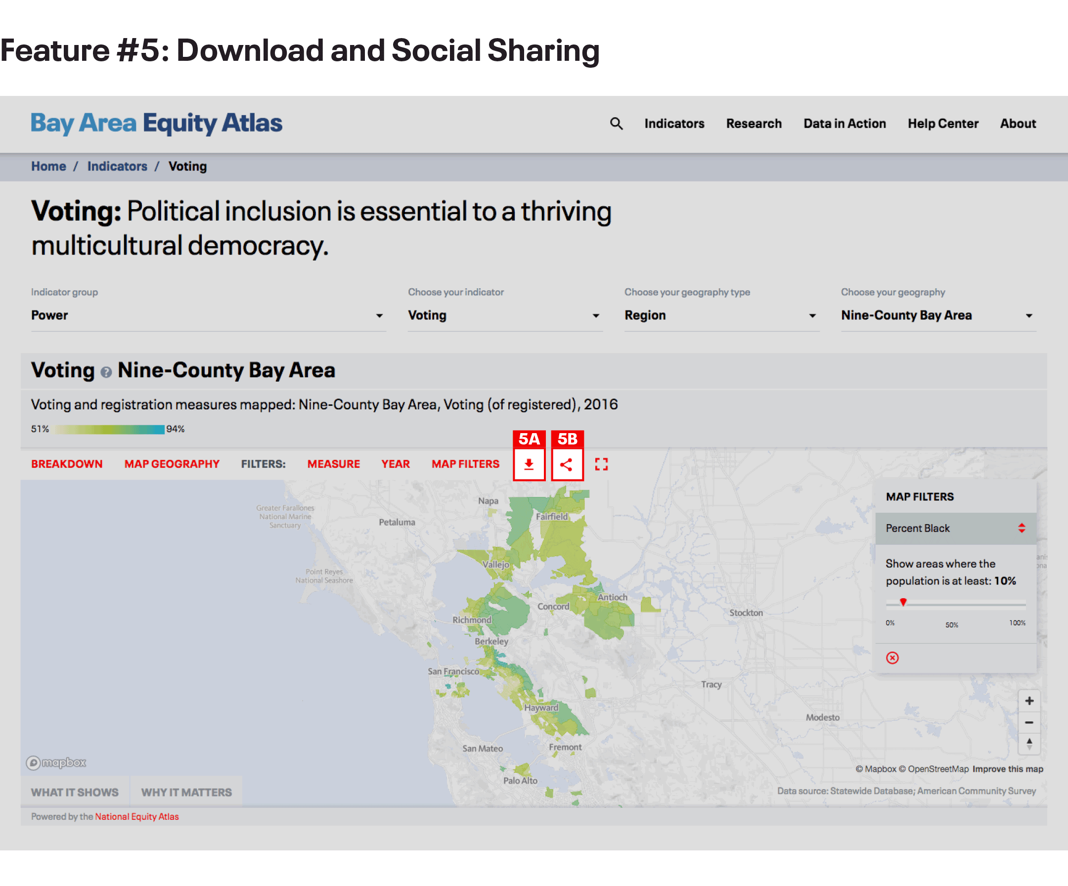
- MASTER IT: Download an excel file to examine the data behind a chart or map. Post a Bay Area Equity Atlas chart or map on your Facebook or Twitter page.
Thank you for exploring the Bay Area Equity Atlas! We hope you are excited enough about these features to let your colleagues know about this new tool. We encourage you to join the discussion on social media using the hashtag #BayAreaEquityAtlas.